2015 presidential debates
The race for the presidential nomination for both parties is going full speed with a plethora of debates. At time of writing there has been 4 Republican debates and 2 Democratic ones. These debates have high impacts on the presidential nomination race with candidates dropping out and polls being shaken.
Text Mining and Natural Language Processing Analysis of the debates have been carried out. The linguistic signature of the candidates and their psychology during their debate performances has been studied and Topic Modeling analysis has also been carried out.
One of the most particular trait of these debates is the large number of participants on the GOP side. Starting at 13 speakers on stage and dwidling down to only 8 speakers in the 4th debate. On the Democratic side, after a 1st debate with 5 participants, 2 dropped out the of the race leaving only Clinton, Sanders and O’Malley for the second debate.
Time Maps
I recently came across this article from Max Watson about timemaps: Time Maps: Visualizing Discrete Events Across Many Timescales.
Timemaps are a very smart way to visualize a sequence of events by looking at the interval of time between each event. Instead of plotting the time serie, the idea is to plot the delta between the times of occurrence. Max Watson does a great job of explaining the idea in the above article and I will not try to rephrase it.
The result of the visualization is a scatter plot or a heat map that can be roughly divided into 4 areas.
- Lower Left: events happen very often
- Upper Right: events happen infrequently
And
- Upper Left: events are followed by a long time before occuring again
- Lower Right: events have not happened in awhile
The closer to the origin the higher the frequency of events.
Time maps for debates
The idea here is to consider debates as a succession of interventions separated by the participants speeches. Instead of time intervals we use words as the distance between debates interventions.
The data and The code
Debates transcripts can easily be found on the web. The transcripts are regrouped in this github repository as python lists that can easily be loaded.
The code below is for the first democratic debate. Filenames and candidates can be adapted for other debates.
import ast
filename    = 'dem_2015_1_list.txt'
speakers    = ['CLINTON', 'SANDERS',"O'MALLEY",'CHAFEE', 'WEBB']
speaker_colors = {'CLINTON': 'red', 'SANDERS':'black', "O'MALLEY":'blue',
                  'CHAFEE':'yellow','WEBB':'lightblue'}
Some initialization
speaker_sequence = []   # memorize the sequence of speakers
timeline = []
# The coordinates as dict with candidates as keys
x = {}
y = {}
# Initialize the lists for each speaker
for s in list(speakers):
    x[s] = []
    y[s] = []
And calculate the time serie by using words as units of time
load_transcript = lambda x : ast.literal_eval(open(x, "r").read())
# The transcript object below is a list of dict.
# Each dict is an intervention with one key (the speaker)
# and one value (the text)
transcript  = load_transcript(filenames[tag])
total = 0
# Loop over each intervention
for item in transcript:
    for k,v in item.items():
        # filter out interviewers and unwanted speakers
        if k in speakers:
            total += len(v)
            timeline.append(total)
            speaker_sequence.append(k)
And this is where the timemap coordinates get calculated. Note this code is taken directly from Max Watson time maps article. Very simple as you can see:
import numpy as np
diffs = np.array([timeline[i]-timeline[i-1] for i in range(1,len(timeline))])
# all differences except the last
xcoords = diffs[:-1]
# all differences except the first
ycoords = diffs[1:]
Now regroup the points by speaker
k = 0
for s in speaker_sequence[0:len(xcoords)]:
    x[s].append(xcoords[k])
    y[s].append(ycoords[k])
    k +=1
And scatterplot away
import matplotlib.pylab as plt
fig, ax = plt.subplots()
for s in speakers:
    plt.plot(x[s], y[s], 'o',label=s, color = speaker_colors[s])
plt.legend()
plt.xlabel('Time before intervention')
plt.ylabel('Time after intervention')
plt.title('1st Democratic debate')
plt.show()
The result
This gives us the following plots for the different debates. I restricted the GOP speakers to the 5 most important ones, i.e. Carson, Trump, Bush, Cruz and Rubio and filtered out interviewers.
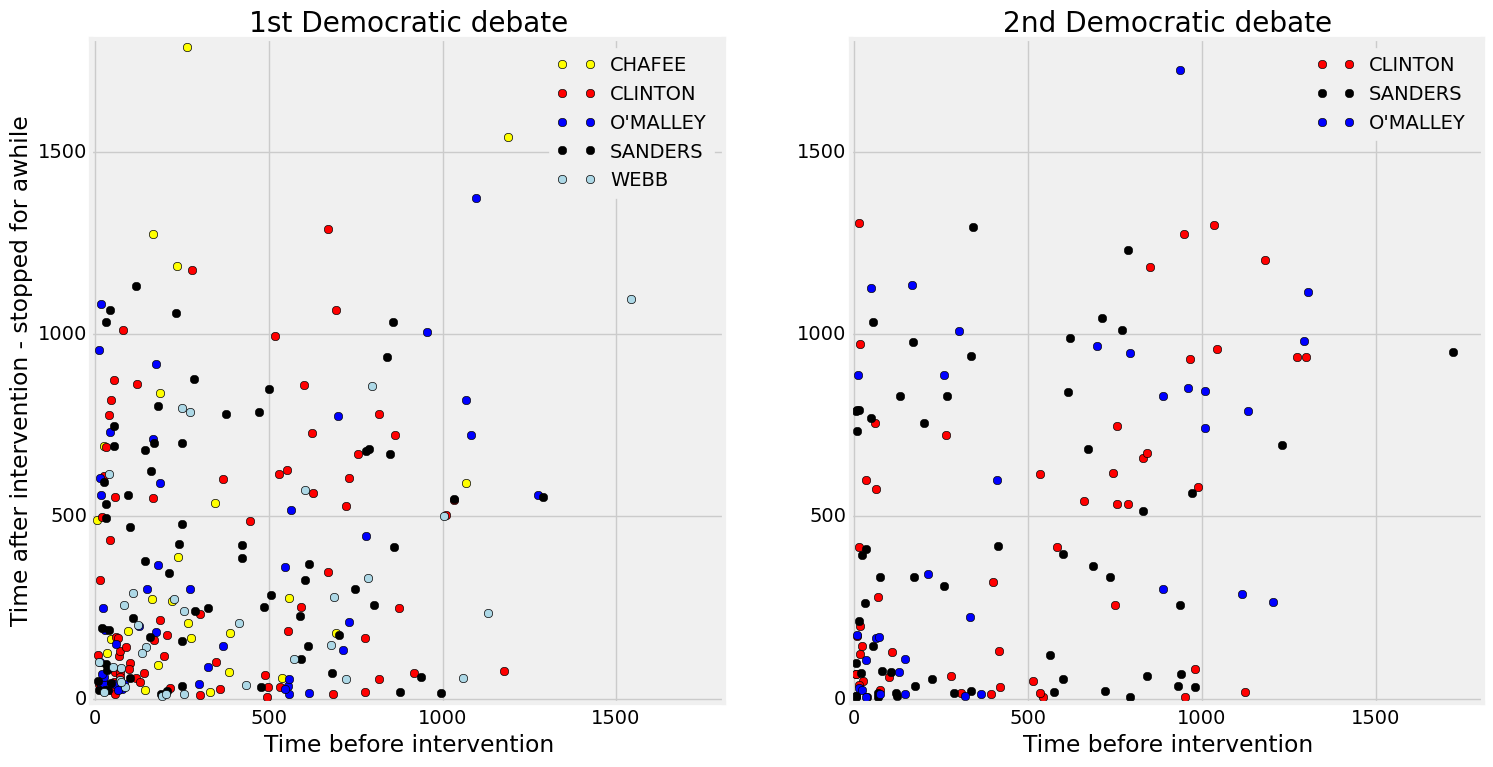
The first and second Democratic debates
The second and fourth Republican debates
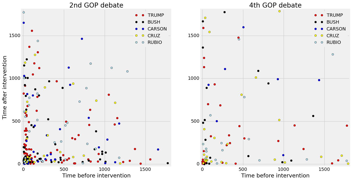
Several things can be observed in the 2 figures above.
Intensity of the debates
The intensity of the debates in terms of the back and forth between candidates varies across debates and parties.
The first Democratic debate is more dense in the lower left corner of the plot (0-500 words) than the second debate clearly indicating that there was more short terms interventions by each speaker.
The center part (500 - 1500 words) of the 2nd Demoratic debate has more dots than for the 1st debate. The candidates took more time to speak.
For the Republicans, the same difference in intensity can be observed with more density in the lower left corner of the plot (0-500 words) for the 2nd debate. In fact there’s even a dense cluster of points composed of approximately 100 words or less. Indicating a series of very brief exchanges, possibly a result of candidates interrupting each others.
However the 4th GOP debate does not show more dots in the central part of the plot (500-1500 words) but does have more dots in the lower right and upper left areas of the plot. These areas indicate speakers that either had to wait awhile before intervening or stopped speaking for awhile.
Stage occupation
Another element can be deduced from these figures. The dots that are the farthest from the origin indicate participants who did not speak for a long time. They either waited a long time after speaking (Vertical) or had to wait before speaking (Horizontal) or both (Upper right). We can see that happening for Chafee (yellow dot - 1st Democratic debate), Rubio (pink - 2nd GOP Debate), Trump (red - 2nd GOP Debate), Carson (blue, 4th GOP debate), Bush (black, 4th GOP debate) and Cruz (yellow, 4th GOP debate).
Balanced debate
The pattern for a well balanced debate would be one with more points in the central area of the plot representing a similar number of words spoken by each participant with more than 500 words spoken at each turn. The 2nd Democratic debate is the closest to that pattern.
Conclusion
Although very simple to implement, Timemaps visualization can even be applied to text mining. It’s a very nifty technique that brings forth lots of insights.
Further examples of timemaps applications:
- The initial blog post by Max Watson: Time Maps: Visualizing Discrete Events Across Many Timescales
- Visualising Customer Call Patterns
- Baltimore Towing Time Maps
- An interactive app to see your own twitter timemap
You can also find more examples on Max’s twitter feed @maxcw247